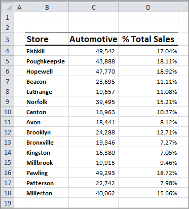
If you have ranges of data that don’t fit on one range you can create, in effect, more than one graph type on the same graph. In the following example, there is a range of data in Column C indicating sales in one department and in Column D the percentage of sales from that department to total sales of all departments.
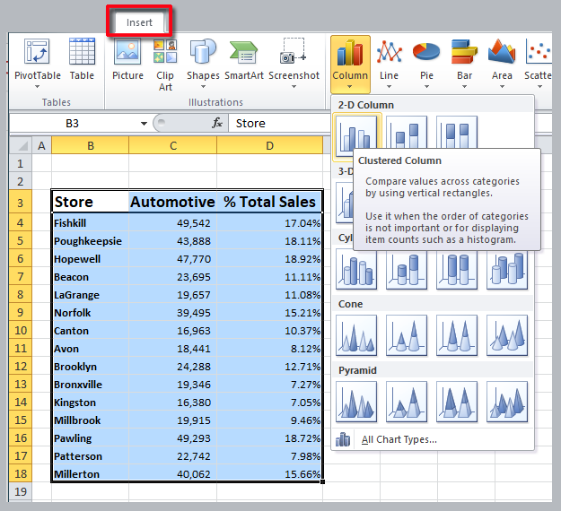
I’ll create a column graph to start with by selecting the entire range.
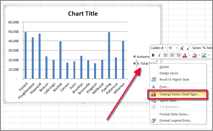
Both ranges are plotted but the percentage doesn’t display correctly. Right click on the percentage data range and select Change Series Chart Type… Be careful that you don’t select the entire legend when you right click. Make sure that only the second series in the legend is highlighted.
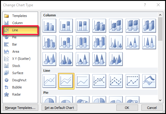
Select Line from the Change Chart Type dialog and click OK.
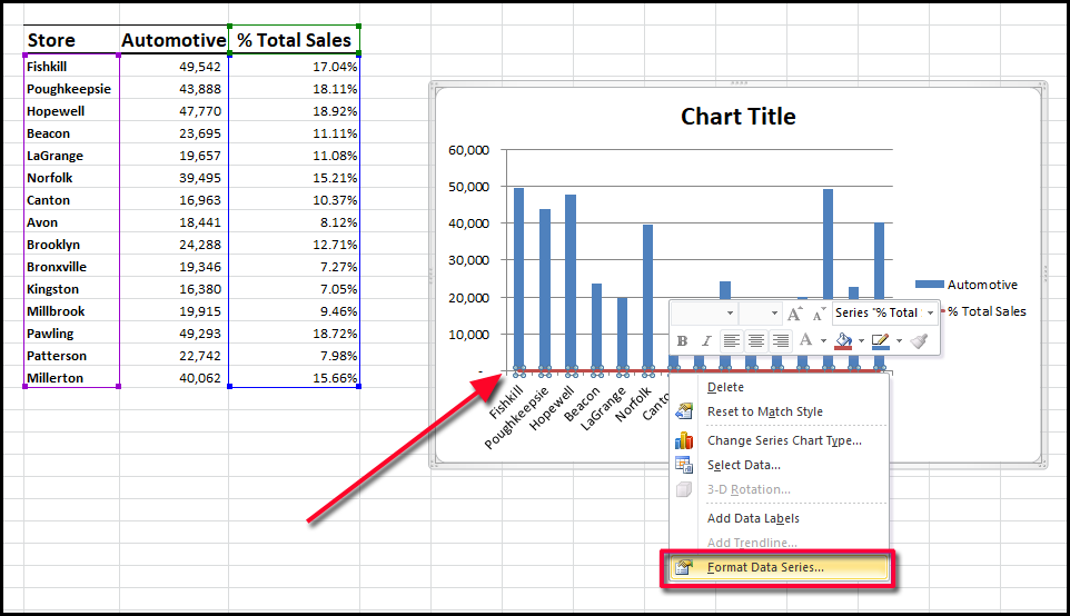
The chart still doesn’t look quite right. Select the second data series, which can be seen highlighted in red at the bottom, right-click and select Format Data Series…
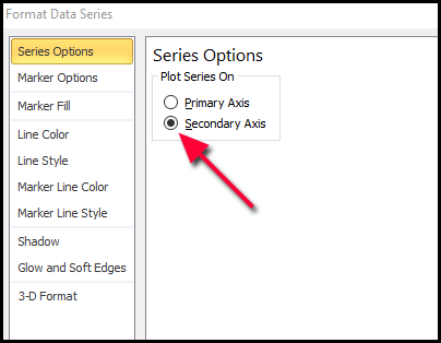
From the Series Options tab, click on Secondary Axis.
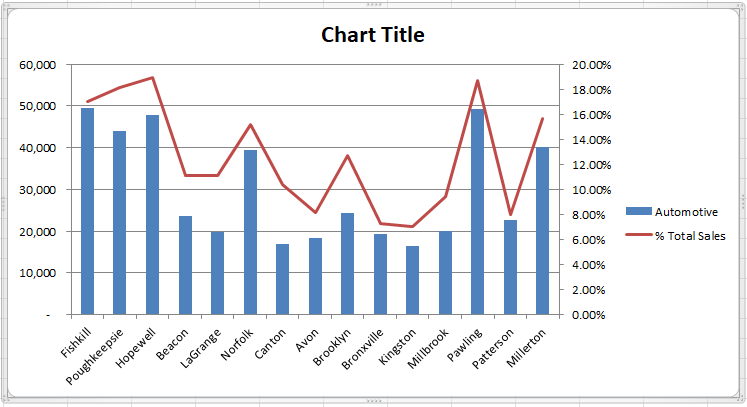
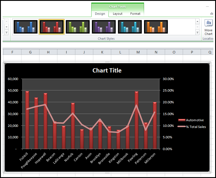
The chart should now display both axes and the percentage data is displayed as a line.
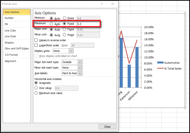
You can play with the secondary axis by right-clicking and selecting Format Axis. Adjust the maximum value in the Axis Options. For Maximum set it to Fixed and enter another value. In this case, I entered .3.
This lowers the line slightly. After using some of the pre-defined formatting from the Chart Tools Design tab, the chart looks like this.
So to recap do the following for the second data range or series.
- Change the chart type.
- Set it to the secondary axis.


0 Comments